By Elena Rowe Social Media Manager
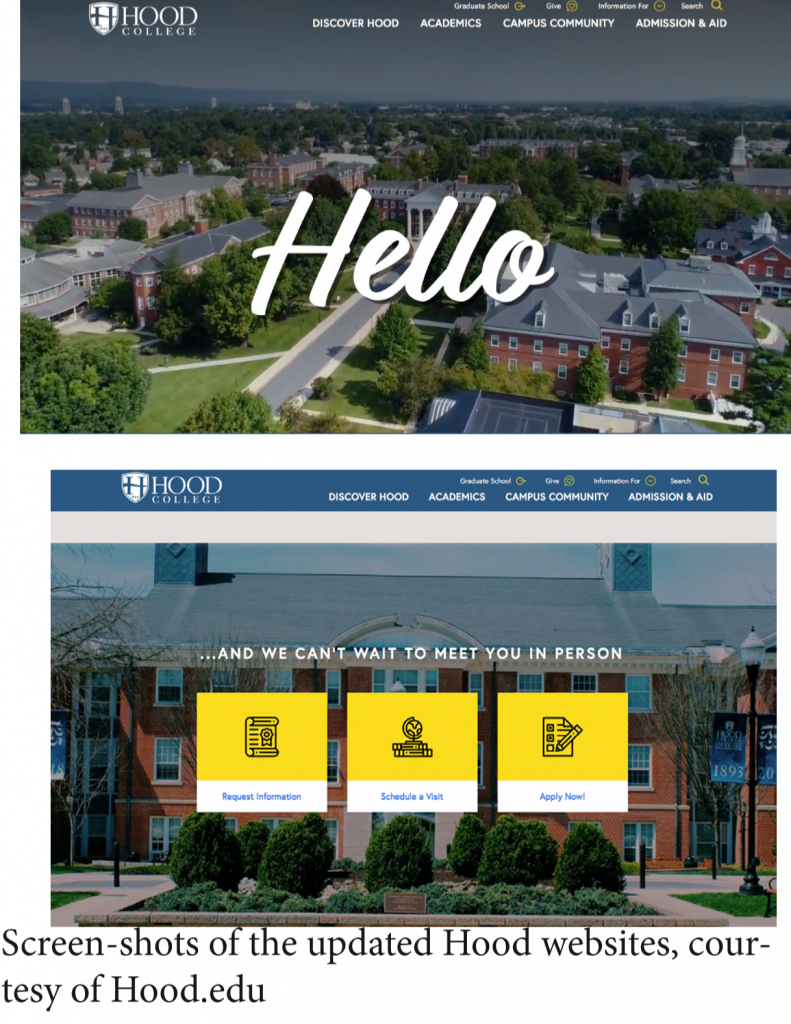
To get inspiration for the site, the team looked at other college websites and “we wanted it to feel like Hood… Lots of images are one of the biggest changes especially the flyover of campus. We have a beautiful campus… We wanted to showcase it,” said Ward. Students generally have had positive feedback for the website. “I love it! It looks fresh and easy to navigate,” said Carrie Ritchie, class of 2020. “The old website was a little confusing because the graphics were bland and seemed disorganized. The heavy use of pictures gives a better visual of campus activities and information.” Some other quirks to the website include Ward’s dog, Bernie, and a story page titled Students in our NeighborHood where students can be featured on the website by filling out a questionnaire on www.Hood.edu/neighborhood. The questionnaire can help prospective students get a more personal insight into the lives of our current students. “The Hood website is really nice and professional looking, it is very interactive,” said Kaitlin Campos, class of 2021. The website is going to continue to be successful by the stories of alumni, current students and faculty that will showcase and tell the beauty and wonders of Hood College for years to come. Jon O’Tang, class of 2021 said, “Although it was at first hard to get used to, it is more modernized and appealing to students.”


Be the first to comment